THE WORLD OF BAR GRAPHS: TYPES, STEPS, AND BAR GRAPH MAKERS

Whether you are a student conducting surveys for research or working on an important presentation at work, you must be thinking of ways to present the data you gathered. Indeed, the first thing that comes to your mind is to use graphs. Well, today’s your lucky day as we are about to teach you the different types of graphs and the steps to making a good bar graph.
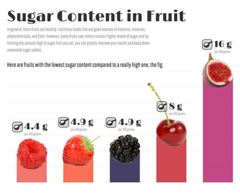
A bar graph is a type of chart that plots data using bars or columns. The bars represent data for a specific category. Bar graphs are more commonly used than any other chart type as most people understand how to read and interpret a bar graph. Bar graphs are widely used in many books, magazines, or newspapers to compare data. If you are not sure how to create one yourself, many bar graph makers online can certainly help.
Also, with these steps that we are about to teach you, making bar graphs will be easier. Read on!
What Are the Types of Bar Graphs?
Bar graphs may be classified into two different types. This section will know what these classifications are and their importance.
Horizontal Bar Graph
This type of bar graph presents data horizontally. The categories are on the y-axis, and the data are placed on the x-axis. The bars are then drawn from the y axis (vertical), going from left to right, with the length corresponding to a certain value on the x-axis.
Horizontal bar graphs are used to graph nominal data. Some examples of nominal data include gender, race, group of people, or country.
Vertical Bar Graph
This type of bar graph presents data vertically. This is the most common type of bar graph. The bars are vertically drawn from the x-axis (horizontal). This is the best type of bar graph to use when you are graphing ordinal variables or data that need to follow an order.
Grouped Bar Graph
Also known as the clustered bar chart, this type of bar graph clusters multiple data sets. The bars each represent data sets under one category. Each category is assigned a color to distinguish one data set easily from another.
Stacked Bar Graph
This type of bar graph is also known as the composite bar chart. It divides a bar or column into different parts. Each part of the bar is represented by different colors that correspond to other categories. For example, in this bar graph, which is also known as a stacked waterfall chart, the part above zero represents the savings. In contrast, the part below zero represents the debt or expenses.
Segmented Bar Graph
This bar graph falls under the stacked bar chart and is known as a segmented bar graph. In this chart, the values of the segments add up to 100%. The bar graph example above shows how a monthly income of USD 4,000 is used.
Each bar is divided into a segment for spending and another for savings.
Here Are the Steps to Making a Bar Graph.
Now that you know the types of bar graphs, allow us to teach you how to make one. Yes, there are indeed many bar graph makers online that can do all the work for you, but learning how to build one yourself will help you understand more about your data, thus, letting you present and explain your graph easily. So before using online bar graph makers, we suggest that you try making your own graph first.
1. Collect Your Data.
Before starting your graph, ensure you have collected all the necessary data. For example, suppose you are to present your company’s financial statement for the past 5 years. In that case, you have to gather all financial reports within the period. Lack of data may result in an incomprehensible and misleading graph.
2. Draw the X and Y axes.
Using graphing paper, draw your x (horizontal) and y (vertical) axes. The result should look like a big letter “L.”
3. Place All Labels and Plot the Variables.
Label your axes, place all the categories and plot the variables. The independent variables (categories) are usually placed along the y axis in a horizontal bar graph. In contrast, the dependent variables (numerical values) are set on the x-axis. It’s the other way around in vertical bar graphs.
4. Draw Your Bars.
Now that you have plotted the variables, it’s time to draw the bars. Refer to your data set and draw each bar.
5. Put a Title.
Create a title for your bar graph and put it on top of your graphing paper.
6. Interpret Your Data.
Now that you are done, you can have a better sense of all the data you have gathered. Determine other vital aspects in your data, such as outliers, gaps, frequencies, and clusters.
Find a Bar Graph Creator Online.
If you already know the basics and fully comprehend your data, you can use a bar graph maker. Venngage is a free bar graph maker. They offer a wide range of bar graph examples, from a simple bar graph to a stacked bar chart.
After signing up for free, you can choose any templates from the dozens of free graphs, charts, and diagrams that they offer. For example, creating a double bar graph using Venngage is much easier than making one yourself. All you have to do is choose which template would be suitable for you, place all the essential data sets needed, and voila! You are done.
Data presentation and interpretation will be much easier once you’ve familiarized yourself with the different types of bar graphs and learned how to use a bar graph maker.


