Tips to Create Website Layout for Better User Experience

yI’ve spent many hours staring at screens, making website layouts. I know how crucial a great user experience is. At our web design agency, we’ve worked with businesses big and small. They all have different challenges and goals. But, making websites that grab attention, keep visitors interested, and turn them into loyal customers is key.
In this article, we’ll share tips and strategies to make your website layout stand out. These tips are for web developers at any level. They’ll help ou make a digital space that makes your business shine and leaves a mark on visitors.
Key Takeaways
- Embrace responsive web design to deliver a seamless experience across all devices
- Adopt a mobile-first approach to ensure your website is optimised for the growing mobile audience
- Implement fluid grids and flexible layouts to adapt to changing screen sizes and user preferences
- Cultivate a user-centric mindset to prioritise the needs and behaviours of your target audience
- Leverage content management systems and search engine optimisation to enhance discoverability and engagement
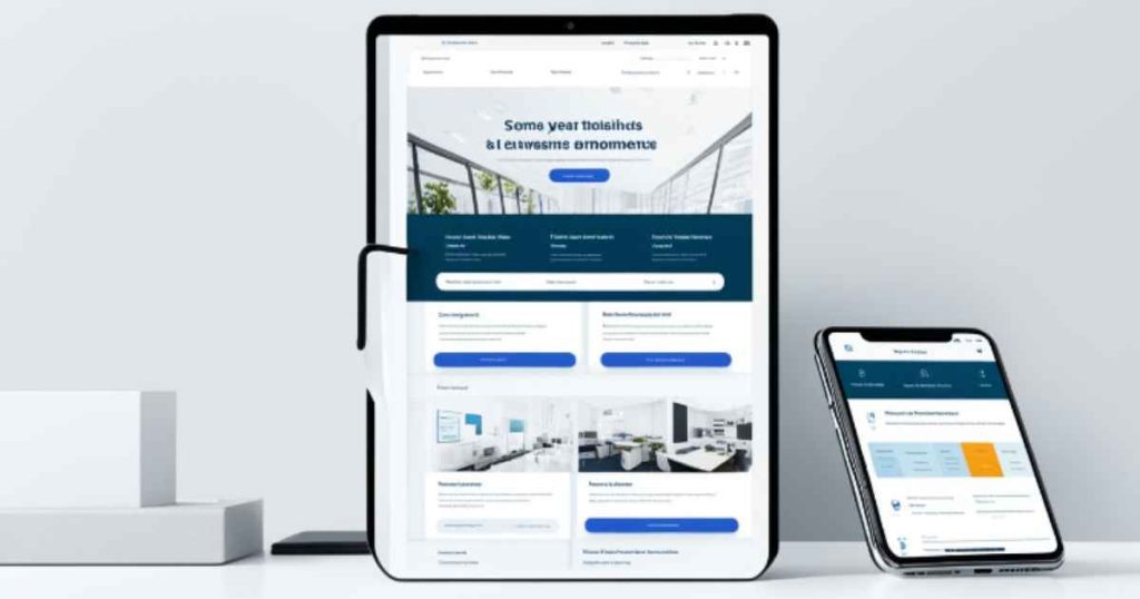
Embrace Responsive Web Design
We’re a top web design agency in Australia. We know that responsive web design is key for a smooth experience on all devices. It means making your site work well on small screens first, then adjusting for bigger screens.
Mobile-First Approach
Starting with mobile in mind lets you focus on the most important parts of your site. This way, your site looks great on phones and tablets. It makes sure your site is easy to use for Australians who mainly use their phones to go online.
Fluid Grids and Flexible Layouts
Fluid grids and flexible layouts are big in responsive web design. They help your site change size and shape for different screens. This makes sure your site looks good and works well, no matter the device.
| Feature | Description |
| Responsive Web Design | A web design approach that ensures a website adapts to different screen sizes and devices, providing an optimal viewing and interaction experience. |
| Mobile-First Approach | A design strategy that prioritizes the mobile user experience, building a website that works seamlessly on small screens first before optimizing for larger devices. |
| Fluid Grids | A grid-based layout that uses flexible, proportional-width columns to adapt to different screen sizes, ensuring content stays aligned and legible. |
| Flexible Layouts | A design approach that utilizes flexible, adaptable elements to create layouts that can adjust to various screen dimensions and orientations. |
Using responsive web design, mobile-first strategies, and flexible layouts makes your website great for all your Australian visitors. It doesn’t matter how they choose to visit your site.
A User-Centric Mindset
At our web design development agency, we always put the user first when making websites. We understand what our target audience wants and need. This means designing a site that connects with them. We use easy-to-use content management systems, focus on search engine optimisation, and choose reliable web hosting for fast loading times and uptime.
When designing a website, think about what your users go through. What problems do they face? What do they look for? How can we make their visit smooth and fun? Answering these questions helps us make a site that looks good and works well.
User experience (UX) design is key to this approach. We do deep research, create user personas, and test prototypes to make sure the site meets your audience’s needs. This focus on UX makes the site intuitive, pleasing to the eye, and engaging for users.
Choosing the right content management system (CMS) is also crucial. A CMS that’s easy for your team to use means your site stays fresh and interesting for visitors. Picking a CMS that fits your business and user needs makes your site both useful and flexible.
How well your website works depends a lot on its hosting service. Working with a trusted web host ensures your site loads fast, stays up, and gives users a smooth experience.
In the end, focusing on the user is vital for a website that really speaks to your audience. By keeping their needs, likes, and issues in mind, we design a site that’s not just pretty but also valuable and engaging for everyone.
Conclusion
By using the tips from our web design agency, you can make your website great for users. Focus on responsive design, putting users first, and always improving your site. This will keep your website interesting and effective.
Our experts know how to make websites that look good and are easy to use. They use mobile-first design and flexible layouts. This makes sure your site works well on all devices and screen sizes.
The secret to a great website is to always think about the user. Put their needs and wants first when designing and building your site. This way, you’ll create a website that goes beyond what users expect. It will increase engagement, drive more conversions, and build loyalty over time.
FAQ
What services does your web design development agency offer?
We offer many services like responsive web design and custom website development. We also provide ecommerce solutions, web application development, and UX design. Our services include CMS, SEO, and web hosting too.
Why is a mobile-first approach important for website design?
Using a mobile-first approach makes sure users have a great experience on all devices. It means designing for smaller screens first, then scaling up for desktops. This ensures your website works well for more mobile users.
How can fluid grids and flexible layouts improve the user experience?
Fluid grids and flexible layouts make your website adjust to different screen sizes and orientations. This means your content and layout change smoothly, avoiding problems like content crowding on smaller devices.
Why is it important to have a user-centric mindset when designing a website?
Having a user-centric mindset is key to making a website that connects with your audience. It means understanding what your users need and want. This can include making your website intuitive, engaging, and tailored to their needs. We use content management systems that focus on user experience and ensure your website is reliable.
What are some key considerations for improving website performance and search engine optimization?
To boost website performance and SEO, focus on fast loading times and being mobile-friendly. Use a content delivery network (CDN), optimize images and videos, and keep your code clean. We can also help with keyword research, on-page optimization, and SEO best practices to improve your website’s search engine ranking.