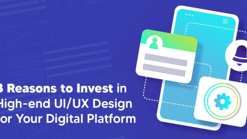
These web design trends will make waves in 2022
It’s no secret that website design trends change constantly. Some fall into oblivion as quickly as they emerge, while others transform the sector for multiple seasons and awaken a new era in the way websites are developed.
Staying updated with the latest website design trends and practices is paramount for the brands that want to attract and convert internet users. And it would be even better if they pioneer an innovative idea and develop a trend others could adopt. The last few years allowed web designers to come up with some of the most innovative concepts due to the advancement of technology. Trends like neomorphism and dark themes have gained great acclaim in the niche market. The website design world encourages creators to challenge the conventional and inspires them to play with layers, mix elements, and experiment with fonts and colours.
2022 will require web designers to focus on interactivity, boldness, and creativity to develop engaging interfaces that attract visitors. Specialists expect to see more designers concentrating on implementing functions that boost usability, accessibility, and functionality to improve UX.
Businesses searching for ways to catch the public’s eye with their website should check the following trends because they’ll definitely make waves in 2022.
Image source https://unsplash.com/photos/Nh4Sxasye24
Inclusive Designs and Content
The internet is filled with great-looking websites, but few of them are accessible to everyone. If you’ve developed a website for your brand, ensure your visitors can relate to your services and products. By creating an inclusive design for your website, you can make your customers trust your products and services more because you make them feel connected with your brand.
An inclusive website is functional and easily accessible for everyone. To achieve it you must create an easy-to-navigate and intuitive user interface, use easy-to-read fonts, and deploy colours that don’t clash. Use plenty of white space in combination with your brand’s colour to consolidate your brand’s positioning.
The content on your website is also important when buying an inclusive online resource because you want to show your public that you share their values and interests. Take note of what subjects your ideal client finds interesting and market your brand accordingly.
However, keep in mind that you want to be inclusive, but you cannot cater to everyone. Customize your website design and content to match your target audience’s needs and preferences.
Gradient Color Schemes
Do you remember when Instagram rebranded its logo, and the public didn’t know what to think about the new design? It was so different everyone noticed it, but few understood the decision to opt for a gradient model. The unique style impacted the entire brand and made it look modern and inclusive. Since 2016, gradients have gained popularity in the web design world and are often used when creating online pages.
If you feel that your website design is flat and no longer resonates with the market’s needs, consider using gradients to elevate it. Gradients are hues that transition smoothly from one to another and make a website design feel modern and timeless at the same time. You could work with a webdesign agency New York based to find a way to include gradients in your website background, icons, logo, or even typography. Even if they’re versatile elements, you must find a balance because they can look overwhelming if you excessively use them.
Asymmetric Layout & Shapes
Asymmetric shapes and layouts were pretty popular in 2021, and nothing seems to stop them down. If you embrace this approach for your website, be ready to change the traditional grid with an edgier one. However, it’s not a bad thing for your brand because it could make it stand out on the market and draw the public’s attention.
If you have plenty of content on your website, integrating asymmetric shapes can be useful because it’ll make it look more organized and engaging. You can choose from countless asymmetric shapes and unpredictable patterns to highlight the pieces of information you want to emphasize. Before including asymmetric lines in your website design, ensure you maintain a balance between the various shapes and forms you integrate to achieve a functional design.
Clean, Neomorphism Design
You may have never heard the term neomorphism before. Don’t worry, you’re not the only one. It’s a design trend that focuses on a clean and subtle look that promotes consistency in design. It features a monochromatic style that focuses on slight colour transitions and shadows to allow the user to focus on the content you deliver on your website. This style is widely popular among internet users, but it’s essential to work with a specialist when employing it because it can produce UX problems if not handled properly.
Storytelling and Interactive Web Design
Interactive web elements like animations are trendier than ever as they enhance user experience. People spend more than on web pages that integrate interactive and responsive features. Unfortunately, only an expert could implement this kind of trend because it requires extensive technical knowledge.
Retro Revolution
Who would have thought that we’ll live to see the retro trend making a comeback? Web designers have started to take inspiration from the Wild West days when they develop pages for energetic brands. Few of you may remember that Web 1.0 and the 90s were characterized by robotic fonts, visible table layouts, and bright hues. Back in the day, web designers had no experience in implementing these elements in a cohesive way that would attract viewers. Also, the profession of web designer wasn’t even invented at that time. But technology evolved, and they can use the years of collective experience to revive the trend.
Web designers love to create a sense of magic through the pages they create. They take retroelements and arrange them in such a way to create the illusion that an invisible hand placed them in space. The reality is that they follow strict rules when combining colours and graphics because they must follow particular UX standards.
Let’s wrap it up!
In the following months, we expect to see web designers get a little more real with the layouts and rely on simple elements to put brands in the spotlight.